El Niño: What Simplified Predictions Get Wrong?

Generalities are common in weather prediction but is that good enough?
In the vast world of predictions, from future home prices to seasonal weather forecasts, readers are bombarded with insights derived from data analytics. These predictions are simplified to be more digestible, but the simplicity often masks any underlying nuances and probabilities.
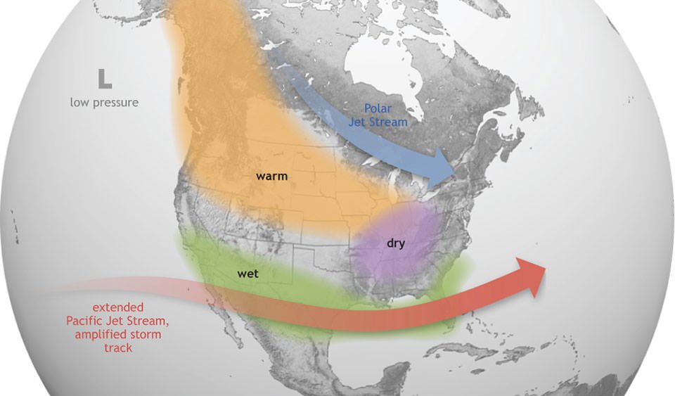
Let’s look at seasonal weather forecasting as an example. El Niño is a cyclical weather phenomenon that occurs in the Pacific Ocean and significantly influences global weather patterns, especially during winter. For North America, this translates to warmer and drier conditions in the north and increased precipitation in the Southern US. When El Niño retreats, it may give way to a La Niña event.

Source: noaa.gov
For the 2023-2024 winter, there is another El Niño event and is projected to be among the top five strongest El Niño events. Forecasters anticipate increased precipitation in the southern US and less in the northern regions, as depicted in the diagram below.

The expected precipitation pattern is based on averaging past El Niño winters from 1952-2022, Source: NOAA climate.gov
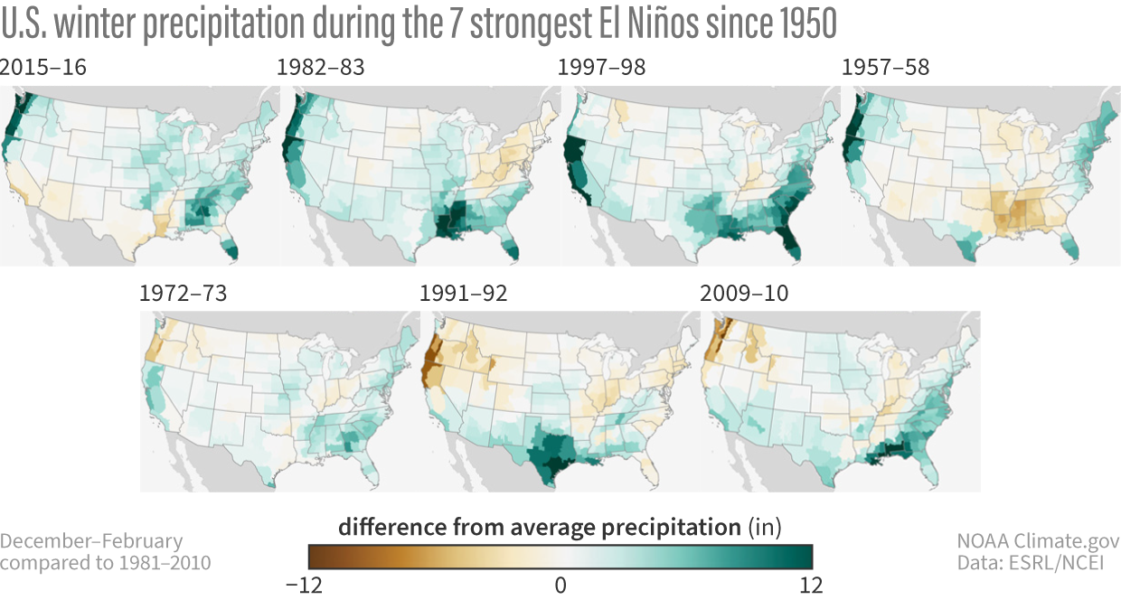
It might seem straightforward: El Niño equals more or less precipitation, depending on your location. But, in the quest for simplicity, certain nuances get omitted. Case in point: while the southwestern US, on average, experiences more precipitation during El Niño, it’s not a guarantee. The El Niño winter of 2015-2016 threw a curveball, defying the prediction models and resulting in less precipitation.

Source: NOAA climate.gov
Data analytics, the magic behind these forecasts, involves applying math, statistics, and machine learning to unveil meaningful insights and patterns in data. Widely used across various industries, it helps calculate credit scores, forecast weather, set ticket prices, and even guide play calls in professional sports. However, the output, often expressed in probabilities and ranges, can be trickier for the average person to grasp compared to simplified statements. The downside of oversimplification is that it can mislead, positioning insights as absolutes rather than probable occurrences.
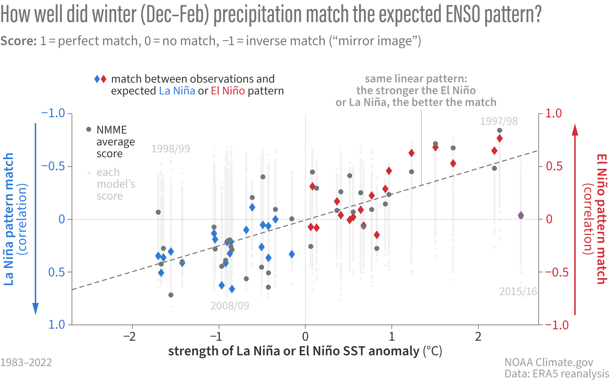
It is understandable why insights are simplified. Take the following diagram. What is it trying to convey? This diagram represents the North American Multi-Model Ensemble (NMME), essentially a supermodel that pulls together various prediction models to forecast El Niño patterns. Without delving into the nitty-gritty of data analytics, the simplified explanation is that: NMME performs well when predicting El Niño during stronger occurrences.

Source: NOAA climate.gov
However, the diagram is capable of providing nuances that a simplified statement cannot. Looking at 2015-2016 El Niño, the prediction models missed the mark and it is considered an outlier in the current models. These outliers are typically excluded and not mentioned in the simplified messaging. Over time, as scientists get a better understanding of the planet’s complex weather system, they will improve on the model and hopefully account for current outliers.
So, the next time you consume content filled with insights derived from data analytics, remember – it’s simplified for your ease of understanding. Nuances are skipped, and the insight is more of a probable reality than an absolute truth. Take it with a grain of salt, and appreciate the evolving nature of insights from data analytics. After all, understanding the weather, much like decoding analytics, is an ongoing learning curve.


